A storefront sign does more than display a business name. It is the first detailed impression most customers form before they walk through the door. The design choices behind it, including format, color, lighting, placement, and how it coordinates with the rest of the storefront, affect whether a passerby slows down or keeps moving.
This guide covers how to approach storefront sign customization to improve visibility and brand presence. If you are assessing whether an existing sign needs repair, updating, or replacement, see our related guides on signs your business sign needs updating for context on what to look for.
Start With Visibility, Not Style
The most common mistake in storefront signage is starting with aesthetics rather than function. A sign that looks good in a design file but cannot be read from the street or identified at the relevant viewing distance is not doing its job, regardless of how well it is designed.
Before any design decisions are made, answer these practical questions:
- How far away will customers see the sign? A business on a fast-moving road needs a sign that reads from a significant distance. A business in a walkable area can rely on close-range readability.
- Will customers approach on foot, by vehicle, or both? Vehicle approach speed determines how quickly the sign needs to communicate its message and how large the text needs to be.
- What angle will most customers see the sign from? A sign visible from one direction only needs to be optimized for that sightline. A sign visible from multiple directions may need to consider multiple viewing angles.
- Are there obstructions? Landscaping, parked vehicles, neighboring structures, and competing signs can all affect how visible the sign is from the road or sidewalk.
Addressing these questions before beginning design ensures the finished sign is appropriately sized, positioned, and legible for the actual conditions of the location.
How to Choose the Right Storefront Sign Format

Different sign formats suit different storefront types and visibility requirements. The right choice depends on the building, the location, and any property or zoning restrictions that apply.
Flat panel and cabinet signs
Surface-mounted flat panels are one of the most common storefront sign formats. They are practical for most building types, accept high-resolution printed or applied graphics, and can be produced in a range of materials including aluminum, Dibond, and acrylic. Cabinet signs, which house internal illumination behind a printed or painted face, extend visibility beyond daylight hours.
3-Dimensional letters and logos
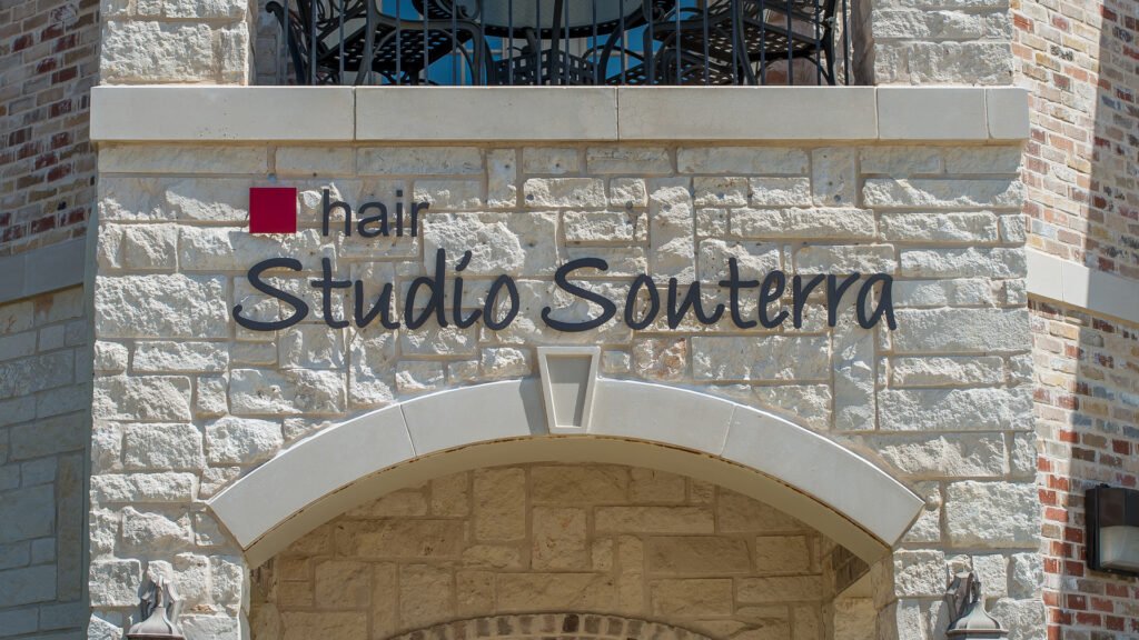
Raised 3-dimensional letters create depth and visual presence that flat panel signs cannot match. Each letter or logo element is individually fabricated and mounted to the building facade, producing a result that reads clearly at distance and carries more visual weight than a surface-applied graphic. Available in metal, acrylic, foam, and PVC with a range of finish options.
Illuminated channel letters
Individually illuminated letters mounted on a building facade or a raceway. Each letter is fabricated with internal LEDs that make the sign visible after dark. Channel letters are a practical choice for businesses that operate into the evening or that want to maintain storefront presence in low-light conditions. They are also one of the most recognizable formats for retail and restaurant storefronts.
Window graphics
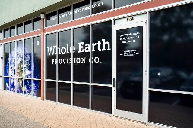
Applied window graphics and decals extend the storefront’s visual presence beyond the primary sign. They work particularly well for communicating business hours, current promotions, and contact information at close range, and for adding branded presence to glass facades that would otherwise appear plain. Frosted or perforated vinyl can also add privacy to interior spaces while maintaining an active visual presence from the street.
What Makes a Storefront Sign Easy to Read?
Legibility is the single most important quality a storefront sign can have. A sign that communicates its message clearly and quickly will outperform a more elaborate design that requires effort to read.
Contrast
High contrast between text and background is the most reliable way to improve readability at a distance. Dark text on a light background or light text on a dark background maintains legibility across different lighting conditions and viewing distances. Color combinations that look distinct on screen may produce insufficient contrast in physical materials, so reviewing how colors will print and appear on the actual substrate is worth doing before production.
Text size and simplicity
Text on a storefront sign needs to be sized for the viewing distance, not for the aesthetic proportions of the design. A useful rule of thumb is that each inch of letter height provides roughly ten feet of readable distance, though actual legibility depends on contrast, font choice, and viewing conditions. The amount of information on the sign face should be kept to what customers genuinely need at that viewing point: typically the business name and perhaps one supporting line. Contact details, hours, and promotional information are better handled by window graphics or secondary signage where customers can read them at close range.
Typeface choice
Clean, open typefaces read more reliably at distance than decorative or highly stylized fonts. A well-chosen typeface can carry significant brand personality while remaining legible. Font selection should be evaluated on how well it reads at the intended viewing distance, not just on how it looks in the design.
Matching the Sign to Your Brand Identity
A storefront sign that does not match the business’s current logo, color palette, and visual style creates inconsistency that customers notice, even when they cannot articulate why. A business whose digital presence reflects a refreshed brand while the building sign still shows the old identity appears to customers as though the transition has not been completed.
Consistency across sign types matters equally. The primary storefront sign, window graphics, and any banners or promotional signage should all reflect the same visual identity. When different sign elements use different versions of the logo, slightly different brand colors, or incompatible typefaces, the overall impression is one of a business that has not managed its presentation carefully.
Working with a single provider for all sign types helps maintain this consistency. Color values drift between print runs from different suppliers, and a provider who holds your brand specifications on file can work to apply them consistently across formats.
Coordinating the Full Storefront Presence
The storefront sign does not operate in isolation. It is one element in the range of visual communication a customer encounters from the moment they notice the business to the moment they walk through the door. Coordinating these elements produces a more cohesive result than designing each one independently.
The primary sign and window graphics
The primary sign handles identification and brand presence. Window graphics handle close-range communication: hours, promotions, contact information, and any visual atmosphere the storefront needs to convey. When both share the same visual language, including colors, typefaces, and visual weight, the storefront reads as intentional rather than assembled from separate decisions.
Banners and temporary signage
Promotional banners are a practical complement to permanent storefront signs for time-limited campaigns. A banner that shares the same palette and type style as the permanent sign reinforces the brand rather than competing with it visually. A banner that uses different colors or fonts draws attention to the inconsistency rather than to the promotion it is meant to communicate.
Vehicle graphics
For businesses that use vehicles regularly, vehicle graphics extend the brand presence beyond the physical location. Vehicles that are regularly parked near or around the business, or that operate in areas where customers are present, effectively extend the brand footprint without additional sign installations.
Outdoor Signage Materials and San Antonio Conditions
Material and finish choices for outdoor storefront signs should reflect the conditions the sign will face. San Antonio’s climate includes significant sun exposure for much of the year, high summer temperatures, and seasonal weather variation. These conditions are worth discussing with your sign provider when specifying materials, finishes, and inks for any outdoor sign installation.
UV-resistant inks and laminates are available options for outdoor signs and may help maintain color quality over a longer installation period. Whether they are worth including depends on the specific placement, the sign type, and how long the sign is expected to remain in service. A south or west-facing installation in direct afternoon sun is a more demanding context than a shaded or north-facing placement, and the specification should reflect that difference.
At Signs of San Antonio, we have been producing outdoor signs in this city for over 40 years. We advise on material and finish specifications based on the actual installation context, not a one-size approach.
To discuss storefront sign design and customization for your San Antonio business, contact Signs of San Antonio for a quote.
Frequently Asked Questions
- How can I make my storefront sign stand out?
Contrast, appropriate scale, and a simple message are the most reliable factors. A sign sized correctly for the viewing distance, with high contrast between text and background, and carrying a clear business name and identity will be more effective than an elaborate design that is difficult to read quickly. Illumination can also improve presence, particularly during evening hours or in locations with limited ambient light. - What design choices make storefront signs easier to read?
Clean, open typefaces at an appropriate size for the viewing distance, high contrast between text and background, and a limited amount of information on the sign face. Decorative fonts and low-contrast color combinations reduce legibility, particularly for customers approaching by vehicle or from a distance. - How do I match my storefront sign to my brand?
Use your current logo file, brand color specifications, and approved typefaces as the reference for the sign design rather than adapting the sign from memory or from an older version of your materials. If your brand has been updated recently, the sign should reflect the current identity, not a previous version. - Do I need to coordinate my window graphics with my storefront sign?
It is worth doing. Window graphics and the primary sign are both customer-facing elements of the same storefront. When they share the same visual identity, the overall impression is more cohesive. When they look like separate design decisions, they can create visual inconsistency that customers notice even if they do not identify it specifically. - How do I know if my current storefront sign is working?
Consider whether customers can find and identify your business without difficulty, whether the sign accurately reflects your current brand, and whether it has remained in good condition over time. If any of these are in question, it may be worth assessing whether the sign needs updating. Our guide on signs it may be time to update your business sign covers the specific indicators in more detail. - Can I add illumination to an existing storefront sign?
In some cases, yes. Whether an existing sign can be retrofitted with illumination depends on its construction, the mounting situation, and whether electrical access is available at the installation point. The most practical approach is to have the sign assessed before assuming a retrofit is feasible.